Ex13 - Plotly-Scattermap:
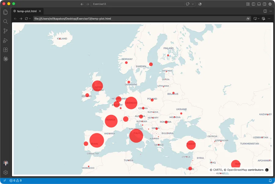
Objective: Use Python to create a bubble map that illustrates the number of world-wide cases of Covid-19 during the first four months.
Description: Create a bubble map using Plotly Graph Objects and Pandas.
- Name the exercise file, Ex13-Plotly-Scattermap.py.
- Use pandas to read-in the 04-17-2020.csv dataset containing data related to Covid-19 available on Canvas. Assign the DataFrame to the variable named,
covid_df. - Extract the latitude and longitude values into separate Pandas Series.
- Set a scaling factor of 80 to each number of confirmed cases.
- Create the map object by calling go.Scattermap() and assigning it to a variable named
trace. - The hover text associated with each marker should display the data in the Location column. Display the markers in a red color.
- Apply the carto-voyager style to the layout. Set the center coordinates to lat = 52.1, lon = 15.2 so the map highlights Europe.
- Update Friday, Oct 2 at 12:00 pm: Open the map in VS Code’s Integrated Browser instead of your regular web browser. In the VS Code Explorer, right-click the generated .html file and select Open in Integrated Browser.
- Name the parent folder: Ex13. Zip the folder which should contain only the python (.py), csv (.csv), and html (.html) files, and submit to Canvas. The Integrated Browser should render an output similar to the below: