Ex12 - Plotly-PieChart:
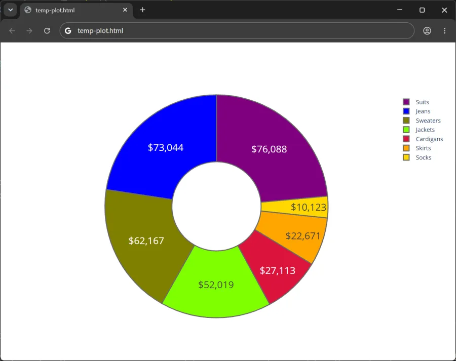
Objective: Create a donut chart (a pie chart with a hollow center) that displays the price of each apparel category (e.g., jeans, jackets, sweaters) and shows the category name and percentage on hover.
Description: Create a donut chart using Plotly Graph Objects and Pandas.
- Name the exercise file, Ex12-Plotly-PieChart.py.
- Use pandas to read-in the Apparel12.csv dataset available on Canvas. Assign the dataframe to the variable named
apparel_df. - Define a Python list named
colorsthat holds one color of your choice for each of the seven apparel categories. Plotly accepts named CSS colors. You’ll pass this list to the marker keyword argument of go.Pie() in a later step. - Create the pie chart object by calling go.Pie() and assigning it to a variable named
trace. - Use the texttemplate keyword argument of go.Pie() to display each apparel category’s price as currency with no decimal places.
- When hovering over a wedge portion of the chart, the label and percentage should display.
- Finally, display the visualization as donut, rather than a pie, with a hole in the center which should occupy 40% of the area.
- Name the parent folder: Ex12. Zip the folder which should contain only the python (.py), csv (.csv), and html (.html) files, and submit to Canvas. The web browser should render an output similar to the below: