Ex11 - Plotly-LineChart:
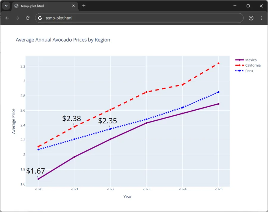
Objective: Create a multi-line chart that displays the average prices of avocados over time in different regions from 2020 through 2025.
Description: Build upon the existing code provided in the Line Charts page of our course notebook to create a multi-line chart with annotations using Plotly Graph Objects and Pandas.
- Name the exercise file, Ex11-Plotly-LineChart.py.
- Add the California and Peru traces (lines) to the plot (chart) found in the course notebook, within the section titled, Line Charts. Make sure to use pandas to read-in the avocados.csv dataset available on Canvas.
- a. Format the line for the California region so it appears as a red dash line. Create a text annotation for the line that highlights the second point and displays the average price.
- b. Format the line for the Peru region so it appears as a blue dotted line. Create a text annotation for the line that highlights the third point and displays the average price.
- Name the parent folder: Ex11. Zip the folder which should contain only the python (.py), csv (.csv), and html (.html) files, and submit to Canvas. The web browser should render an output similar to the below: