Pie Charts:
- To create a pie chart, we can define a Python list stored in the variable, continents, which contain some of the continents on Earth beginning on line 4.
- We can then set up another list on line 12 with the population for each of these continents specified in millions.
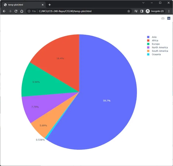
- On line 14 we can instantiate a pie chart by calling the Pie class from our graph objects module. The input arguments to the go.Pie() class are the labels we want associated with various pieces of the pie, and the corresponding proportions which are the values of the pie.
- The single trace on line 16 makes up the data for the chart, specified in the form of a list. Then finally, we use the plot() function and pass in only the data list.
python
1import plotly.graph_objs as go
2import plotly.offline as offline
3
4continents = ['Asia',
5            'Africa',
6            'Europe',
7            'North America',
8            'Oceania',
9            'South America']
10
11# Specified in Millions
12populations = [4436, 1216, 739, 579, 40, 423]
13
14trace = go.Pie(labels = continents, values = populations)
15
16data = [trace]
17offline.plot(data)
Output:
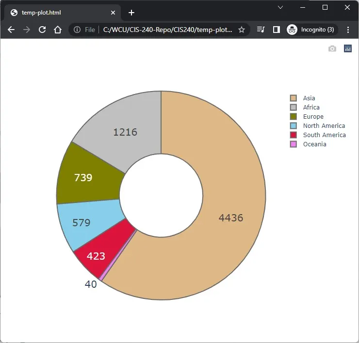
Styling the Pie Chart:
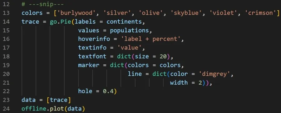
- To style the chart, we can specify a list of colors on line 13.
- Within the Pie() class, we can change additional characteristics of the chart by modifying some of the parameter properties, including:
- Line 16: When we hover over a particular wedge, only show the label associated with that wedge and percent data.
- Line 17: The population data expressed in millions represented as text on the wedge.
- Line 19: The marker parameter allows us to customize how the wedges look, including a way to reference the list of colors.
- Finally, on line 22 we can display the visualization as donut, rather than a pie, with a hole in the center which occupies 40% of the area.
Output: