Reading Data with Pandas:
- Offline plots in Plotly are those visualizations which are not going to be shared online with anybody. You can construct offline plots in Plotly using the offline module, and that’s what we invoke on line 1 below.
- Line 2 represents the graph objects module, which is aliased as go. Graph objects is a dictionary-like object with various properties, and this is what we use to functionally construct our plots.
- The dataset, representing avocado prices over time in the below example, is read in on line 5 using the pandas library. Pandas allows you to represent data in a tabular format in rows and columns.
- The resulting information is held in what is called a pandas dataframe, which is in the df variable listed below:
python
1import plotly.offline as offline
2import plotly.graph_objs as go
3import pandas as pd
4
5df = pd.read_csv('avocados.csv')
6print(df)- Terminal Output:
| Year | Mexico | California | Peru |
|---|---|---|---|
| 2020 | 1.67 | 2.11 | 2.07 |
| 2021 | 1.97 | 2.38 | 2.21 |
| 2022 | 2.21 | 2.61 | 2.35 |
| 2023 | 2.43 | 2.85 | 2.48 |
| 2024 | 2.56 | 2.95 | 2.64 |
| 2025 | 2.69 | 3.24 | 2.85 |
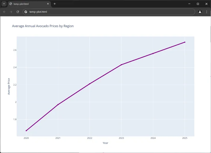
- Note the above dataset contains the average price of avocados in Mexico, California, and Peru over a period of six years.
Creating a Line Chart:
- To create a visualization with one or more traces/elements, we can call the Scatter() class on our graph objects module.
python
7# ---snip---
8trace0 = go.Scatter(
9    x = df['Year'],
10    y = df['Mexico'],
11    name = 'Mexico Origin',
12    line = dict(color = 'purple',
13                width = 4,
14                dash = 'solid')
15)
16
17data = [trace0]
18layout = dict(title = 'Average Annual Avocado Prices by Region',
19              xaxis = dict(title = 'Year'),
20              yaxis = dict(title = 'Average Price'),
21             )
22
23fig = dict(data=data, layout=layout)
24offline.plot(fig)- Output:
Annotations:
-
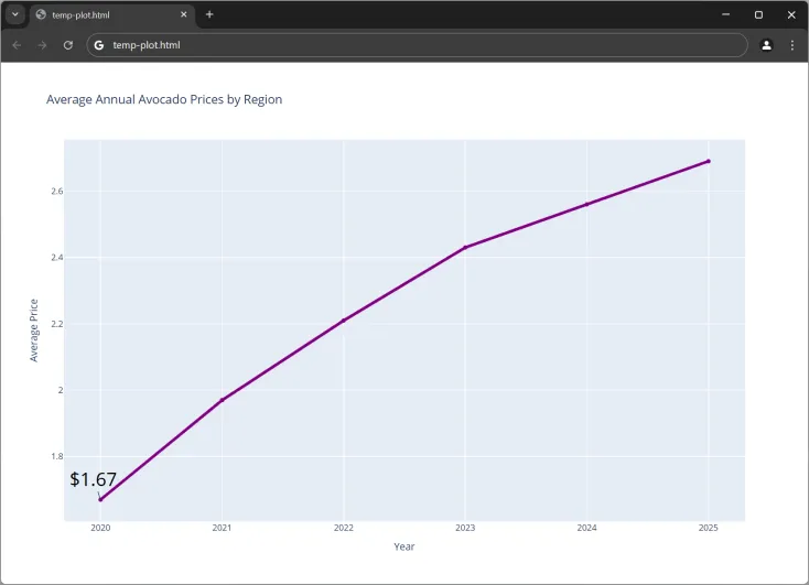
Annotations are a great visual aid to highlight important bits of information. Annotations can be specified by using the simple Python dictionary of properties.
-
Ex: Let’s create a text annotation highlighting the first point in the line which represents the average price of avocados in Mexico in the year 2020.
- First, move both the fig variable and the offline module to the very end of the file.
- Lines 24 & 25 represent the x and y coordinates for the annotation where the line starts for Mexico.
- The text attribute in the dictionary indicates that this is a text annotation on line 26, which is the average price of avocados, and the font attribute styles how this text is represented.
- Finally, note that annotations can be added to any Plotly visualization. They’re appended to the annotations dictionary key within your layout below on line 31.
python
22# ---snip---
23annotations = []
24annotations.append(dict(x = df['Year'][0],
25                        y = df['Mexico'][0],
26                        text = "$" + str(df['Mexico'][0]),
27                        font = dict(size = 26, color = 'black')
28                        )
29                    )
30
31layout['annotations'] = annotations
32fig = dict(data=data, layout=layout)
33offline.plot(fig)- Output: