Skip to content
- ScatterWidget from the drawdata library is a tool that allows users to visually draw data points on an interactive canvas.
- After drawing, the widget captures the coordinates of the points (x, y) and lets you use them in your data ecosystems.
- To install the library, issue: uv sync once the corresponding exercise repository is cloned and the virtual environment is activated.
- Create the Widget:
- ScatterWidget() creates an interactive widget where you can draw data points.
- Displaying widget in a Jupyter Notebook will open an interface where you can click to draw points.
- Draw Points:
- Use your mouse to draw points directly in the widget interface. The widget collects the (x, y) coordinates of the points you draw.
- Retrieve the Drawn Data:
- After you’ve finished drawing, you can retrieve the data as a Pandas DataFrame by using the widget.data_as_pandas property.
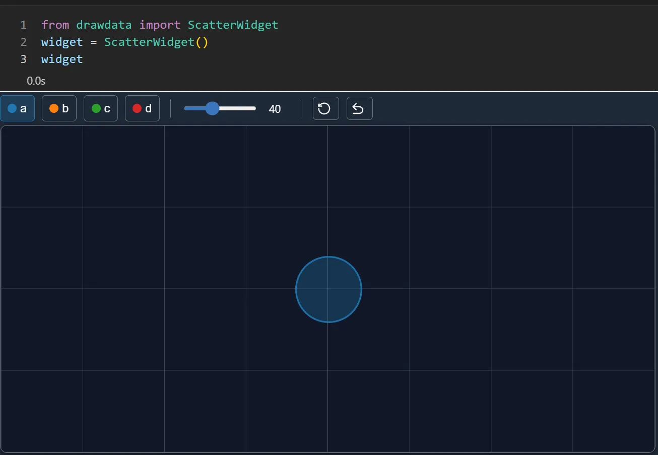
- A smaller brushsize creates finer, more precise points on the canvas.
- Ideal for generating evenly distributed datasets or when precision is needed.
- A larger brushsize creates larger dots or blobs on the canvas.
- Useful for quickly creating clusters, heatmap-like distributions, or when you need a dataset with more variability in fewer clicks
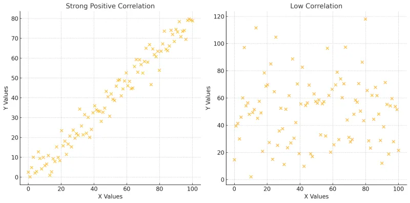
- Strong Positive Correlation:
- In this case, Y values closely follow X values with a predictable upward trend, plus a small amount of random noise.
- Example: The amount of advertising spent (X) and the revenue generated (Y) by a company.
- Trend: As advertising spending increases, revenue also increases.
- Weak Correlation:
- Here, Y values are scattered without a clear relationship to X with no clear trend.
- Example: The daily temperature (X) and the number of website visitors (Y)
- Trend: The number of website visitors fluctuates without an clear connection to temperature.